5 Mistakes to Avoid When Designing Your Business Website
By Azalea Creations Web and Graphic Design
Your business website is often the first impression potential customers have of your brand. In today’s digital world, an effective and well-designed website is not just a marketing tool but a critical part of your business success. However, many companies unknowingly make design mistakes that hinder their website’s performance, SEO, and ability to convert visitors into customers.
At Azalea Creations, we understand how important a strong website is for your brand, which is why we’re highlighting the five common mistakes to avoid when designing your business website. Whether you’re using a DIY website builder or working with a professional web designer, steering clear of these pitfalls will help you create a website that looks great, functions smoothly, and drives conversions.
Mistake 1: Ignoring Mobile Responsiveness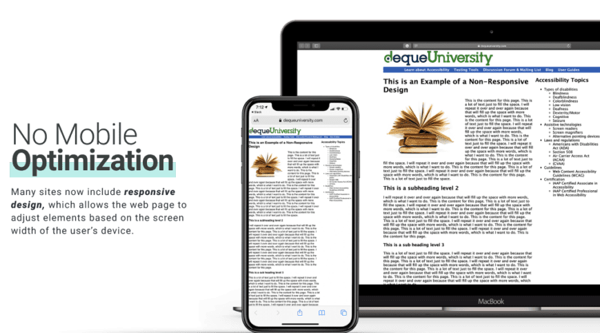
One of the biggest mistakes businesses make is designing a website that doesn’t prioritize mobile responsiveness. In 2024, more than 60% of global web traffic comes from mobile devices, and that number continues to grow. If your website isn’t optimized for smartphones and tablets, you’re missing out on a massive audience. Google also uses mobile-first indexing, which means it prioritizes mobile-friendly websites in its search results.
A mobile-responsive website adjusts to different screen sizes, ensuring that visitors on any device—whether it’s a smartphone, tablet, or desktop—have a seamless experience. Ignoring this can lead to frustrated users who quickly leave your site, negatively affecting your bounce rate and overall SEO ranking.
How to Avoid This:
-
Choose a responsive design that automatically adjusts to various devices and screen sizes.
-
Test your website across multiple devices to ensure that the layout, buttons, images, and text are user-friendly on mobile.
-
Optimize your loading speed for mobile users by compressing images and eliminating unnecessary code.
Keywords: mobile-responsive website design, mobile-first indexing, responsive design, mobile SEO, website bounce rate
Mistake 2: Cluttering the Design with Too Much Information
When it comes to website design, less is often more. One of the most common mistakes business owners make is trying to cram too much information onto a single page. While it’s important to provide visitors with essential details about your products, services, or company, overwhelming them with too much text, images, and graphics can make your website look cluttered and confusing.
A cluttered website makes it harder for visitors to find what they’re looking for, leading to frustration and a higher bounce rate. User experience (UX) is key to keeping visitors engaged, so avoid overwhelming them with walls of text or excessive design elements that distract from your main message.
How to Avoid This:
-
Use white space to give your website a clean, organized look.
-
Focus on a clear hierarchy, ensuring that the most important information (like your value proposition) stands out.
-
Break up large chunks of text with headings, bullet points, and short paragraphs.
-
Limit the number of visual elements on each page to avoid overwhelming the visitor.
Keywords: clean website design, user-friendly websites, effective website layout, website bounce rate, website white space
Mistake 3: Poor Navigation and Site Structure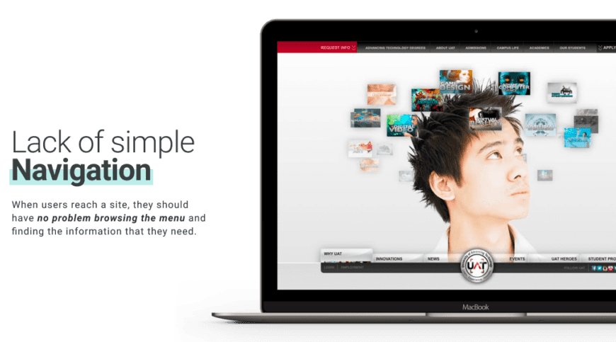
Your website’s navigation plays a crucial role in helping users find the information they need quickly and easily. Confusing or complicated navigation is one of the most common reasons visitors leave a website. If your site is difficult to navigate, potential customers are more likely to get frustrated and click away to a competitor’s site. This can also hurt your SEO, as Google values a clear and well-structured site for ranking purposes.
Your navigation should be intuitive, making it easy for users to browse your services, products, or blog without unnecessary clicks. A well-organized site structure also helps search engines crawl and index your content more effectively, boosting your website’s visibility.
How to Avoid This:
-
Keep your navigation simple, with clear and descriptive menu labels (e.g., “Services,” “About Us,” “Contact”).
-
Use a sticky navigation bar that stays at the top of the page as users scroll.
-
Ensure that every page on your site is no more than two or three clicks away from the homepage.
-
Use internal links to guide visitors to related content, improving both UX and SEO.
Keywords: website navigation tips, user-friendly navigation, simple site structure, SEO-friendly website, internal linking strategy
Mistake 4: Not Optimizing for Speed
Page load speed is more important than ever. In fact, research shows that if a website takes more than three seconds to load, over 50% of visitors will abandon it. Speed is also a major factor in Google’s ranking algorithm, meaning that slow-loading websites are penalized with lower rankings in search results. Slow websites lead to frustrated users, fewer conversions, and lost revenue.
Factors like large images, unoptimized code, and too many third-party plugins can drastically slow down your website. Ensuring that your site loads quickly not only enhances user experience but also improves your SEO performance.
How to Avoid This:
-
Compress images and use the appropriate file formats (e.g., JPEG for photos, PNG for graphics with transparent backgrounds).
-
Minimize the use of heavy animations or auto-play videos that slow down page load times.
-
Enable browser caching to store elements of your website locally on users’ devices, speeding up future visits.
-
Use a reliable hosting provider with fast servers.
Keywords: website loading speed, optimize website for speed, fast-loading websites, website speed for SEO, image compression for websites
Mistake 5:  (CTAs)
Your website’s call-to-actions (CTAs) are one of the most important tools for converting visitors into customers. A weak or unclear CTA can make users unsure of what to do next, which results in missed opportunities for lead generation or sales. Whether you want users to sign up for a newsletter, schedule a consultation, or make a purchase, your CTAs should be clear, compelling, and easy to find.
Many websites either hide their CTAs too far down the page or use vague language like “Click Here” that doesn’t explain the value of the action. A well-designed CTA tells users exactly what action to take and why they should take it, making it an essential element of an effective website.
How to Avoid This:
-
Use actionable language that encourages users to take the next step, such as “Get a Free Quote” or “Shop Now.”
-
Place your CTAs in prominent locations—above the fold, in the middle of the page, and at the bottom.
-
Make sure your CTAs stand out with contrasting colors and larger fonts.
-
Use A/B testing to experiment with different CTA designs and placements to see what works best.
Keywords: effective call-to-action, high-converting CTAs, optimize website CTAs, lead generation CTAs, A/B testing CTAs
Why Professional Website Design Matters
At Azalea Creations, we’ve seen firsthand how avoiding these common website design mistakes can significantly improve your website’s performance and overall success. Many businesses, especially small and medium-sized enterprises, make the mistake of cutting corners with DIY website builders or neglecting key elements of web design.
While DIY platforms like Wix or Squarespace offer convenience and affordability, they often lack the advanced customization and performance optimization needed for a truly professional business website. By hiring a professional web designer, you ensure that your site avoids these pitfalls, functions smoothly across all devices, and delivers an exceptional user experience.
Our professional design team at Azalea Creations specializes in building custom websites that are not only visually stunning but also optimized for SEO, conversion rates, and user experience. We focus on creating websites that reflect your brand’s unique identity while avoiding the common mistakes that can hurt your online presence.
Keywords: professional web design services, custom website development, web design for small businesses, avoid website mistakes, Azalea Creations web design
Conclusion: Avoiding Mistakes for a Better Website
Your website is the digital face of your business, and avoiding common design mistakes is crucial for its success. By focusing on mobile responsiveness, clean design, easy navigation, fast loading speed, and strong CTAs, you can create a website that not only looks great but also performs well in search engines and converts visitors into customers.
If you’re unsure about how to avoid these website design mistakes, or if your current website is underperforming, it may be time to consult with a professional. At Azalea Creations, we’re committed to helping businesses create websites that drive results. Contact us today to learn how we can help you design a website that stands out from the competition.